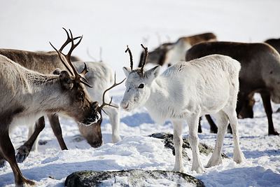
Reindeer in Finnish Lapland. Photo from Visit Finland.
In my last post, I analyzed the six U.S. tourism websites that the travel site skift.com considers to be among the 20 best-designed such websites in the world.
I was particularly impressed with the Oregon and Los Angeles visitor websites. For me, great website design encompasses not just spectacular visuals and clean typography but easy navigability leading to compelling, well-organized content. The other sites (Massachusetts; Washington, DC; Tennessee [Fall season]; and Florida, while all well designed, also contained some flaws.
If potential visitors — the baby boomer travelers that I focus on, in particular — get frustrated by not being able to find something they’re looking for right away, they may go elsewhere to find it rather than spending the crucial extra minutes on the site that might convince them to visit the destination. Tennessee, for example, has beautiful new sites for each of the four seasons, but they’re very difficult to locate from the home page of the state’s main site. They should be highlighted, not hidden.
Today I’d like to look at some of the websites elsewhere around the globe that skift picked out for their top 20.
I’ll start with one I think is as close to perfect as a travel website design can get: visitfinland.com.
Arresting images of Finland in winter — such as the Northern Lights, a dog sled team, “a refreshing dip in icy water,” and Santa Claus, which bring the site right up to date in late December — draw you in. As you scroll down the home page, you come upon “picture boxes” beckoning you to learn about sauna culture, an icebreaker cruise, and Finnish cottage life, among other topics. Lower still, more visually compelling picture boxes lure you into discovering Finland’s top destinations, the four seasons, and various themes to pursue.
As an aside, but an important one, the site is beautifully written. One of my favorite areas is found via the top of the home page. Click on “About Finland” and you’ll find a lighthearted list of things to do in Finland “at least once,” “what you won’t see in Finland,” and other lists. Very clever and nicely done. The entire team who worked on this site deserves congratulations — it makes you want to board the first flight to Helsinki.
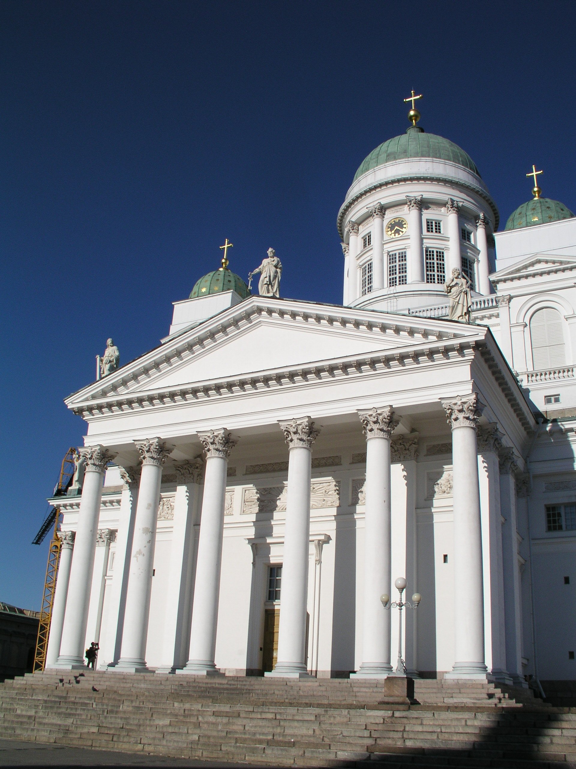
Helsinki Cathedral, Finland. Photo from Visit Finland.
Then there’s the website for Visit Skane, which promotes a region in Sweden: visitskane.com. The problem is a lot of people don’t know where Skane is, and unless you click on the tiny little word “Map” — which I didn’t even notice until my third visit to the site — you barely get a hint on the home page that Skane is in Sweden, much less where it is in Sweden (it’s the southernmost province).
What the home page needs is a big, clearly labeled map of Sweden with Skane outlined in bold colors, so we know where we are or may want to go. Otherwise, as a consumer, I’m heading over to visitfinland.com as fast as I can — where there are a lot more photos, too.
Hungary’s tourism website, gotohungary.com, features a home page dominated by the picture of a young woman and a number of tabs at the top that lead you to inside informational pages. If you click on the first tab, “About Hungary,” nine different categories come up with dozens of different topics. It’s a little overwhelming and lacks the kind of visually arresting elements that draw you in. The boxes toward the bottom of the home page leading to “Spa and Wellness,” “Food and Wine” and “Culture” information just lead to more boxes and, to my mind, lots of confusion. This site would definitely not make my top 20.
VisitCopenhagen.com lauds Copenhagen as the “world’s most livable city” but I can’t say the same for the website — there’s so much going on on the home page that I quickly tuned out.
Leaving Europe, I took a look at NewZealand.com. If you go to the main site, there are links to “Holiday With Us,” “Do Business With Us,” “Study With Us,” or “Live and Work With Us.” “Holiday With Us” takes you to the tourism website, where the home page is dedicated (at the moment) to scenes of hobbits and “Middle Earth,” with links to movie settings, as well as golfing and some beautifully illustrated advertisements for Air New Zealand.
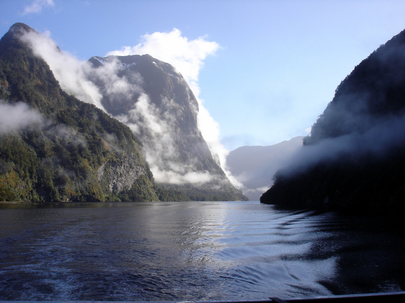
Milford Sound is one of New Zealand’s top attractions. Photo by Clark Norton
The commercialism is a little off-putting, but there’s a helpful feature at the bottom of the home page (“Essential New Zealand,” with links), an easy-to-read map of the Pacific showing air routes from the U.S. to Kiwi country, and several tabs at the top that lead to links for all the inside nitty-gritty info, illustrated with beautiful photography throughout. All told, a very nice site.
Skift also includes Greenland.com, singling out its unusual typeface that promotes the “Big Arctic Five” that might bring tourists to the country: dog sledding, whales, snow and ice, pioneering people, and the Northern Lights. The site is loaded with colorful photos and videos that made me want to make a return visit to Greenland ASAP, or at least when it warms up a bit.
On that note, TravelBelize.org quickly transported me to the tropics via, as skift points out, the dramatic use of embedded video on its home page. As soon as you go to the site, you’re in the middle of the action in Belize: dancing, swimming, viewing wildlife, or skimming over the treetops. I also like the feature right below the videos: “Belize is closer than you think,” showing flight times from across North America.
As you scroll down the home page, you’re led to colorful displays highlighting activities like scuba diving, snorkeling, sailing, birding, archaeology, drumming, and Mayan culture. And at the top of the home page are tabs that lead to easy to follow links to all the helpful info you need. Belize has a winner here.

A Malaysian longhouse. Photo from Malaysia Tourism.
Tourism Malaysia’s website doesn’t have a great URL (www.tourism.gov.my) but some terrific visuals on the home page help make up for that. Stunning photos of rainforests and highlands, sea turtles and state of the art shopping quickly transport you to Southeast Asia. Unfortunately the inner pages aren’t nearly so compelling or user-friendly. Much of the inside material is downright hard to follow.
Other global tourism websites in skift’s top 20 include Tourism Ireland (www.ireland.com); Visit Brasil (www.visitbrasil.com); Visit Stockholm (www.visitstockholm.com); the LoveWall section of VisitBritain.com (www.lovewall.visitbritain.com); Visit Norway (www.visitnorway.com); and It’s More Fun in the Philippines (www.itsmorefuninthephillipines.com). (The latter has given over its landing page to a message about rebuilding after the devastation of the recent typhoon.)
They’re all worth checking out — especially visitfinland.com, a state-of-the-art product.
You can read the original skift.com piece here.
I’d welcome comments about my assessments, whether positive or negative.
You might also like:
Are These the Best-Designed U.S. Tourism Websites?
Be sure to download my free report, “How to Ride the Coming Wave of Boomers,” available here. It’s all about the best ways to market travel to baby boomers — the biggest-spending group of travelers the world has ever seen. It’s also the easiest way to subscribe to my blog, so you won’t miss a posting. Thanks!
Leave a Reply


![]() Follow me on Twitter
Follow me on Twitter
![]() Connect on Facebook
Connect on Facebook
![]() Amazon Author page
Amazon Author page
![]() Connect on LinkedIn
Connect on LinkedIn


Get My Latest Report for FREE:

Click to download: How to Ride the Coming Wave of Boomers ... And Attract the Biggest-Spending Travelers the World Has Ever Seen!
- Singapore: Shimmering Modernity, Touches of the Past
- How to Plan a Surprise Trip Without the Stress
- Tromsø: Top of the World Film Fest
- Relish a Radish? Come to Oaxaca
- Feeling Festive? Try Quebec City, Santa Fe
- The Perils and Pleasures of Navigating a French Canal
- How to Add Fun to Business Travel
- Where to Find the Real St. Patrick
- “Stunning! Breathtaking!”: The Chatbot’s Guide to Portugal
- Traveling with a Disability? Here are 5 Tips

One Response to Is Finland’s Tourism Website the World’s Best?